The Dark Court
![]() the 3rd quarter of 2001
the 3rd quarter of 2001
�
Written by The Dark Judge of Focus
Greetings.
It's�no secret that the quantity of demos has decreased, but what about the quality? To answer this question, I've decided to check out today's�demos and rate all of them from 10 (very bad) to 99 (near-perfect).�
What I'm really looking for are demos that prove to me that the c64 demo scene still is worth something. These are labelled screengems by me, and fall into one of the next categories: GOOD demos (75�79), GREAT demos (80�84), EXCELLENT demos (85�89), EXQUISITE demos (90�� 94) and MAGNIFICENT demos (95�� 99).�
Since I�realize my taste probably differs from yours, I'll also tell you about the productions which aren't that special to me, but might be more of your liking. Ofcourse there is a limit to what I�spend my time on, so those will have received at least 60�points from�me.
As for the rest? To me they weren't worth the download, and I�advise you to stay clear of them as�well.
I�am The Dark Judge. This is my court.
SCREENGEMS
CIVITAS
Thief
(75)
At 29�blocks and 5�parts, this might byte for byte be one of the most valuable
demos ever on the c64. Stylistically it's�clearly influenced by the likes of
Panoramic Design and Triad with lots of strange little animations in shades of
green.�
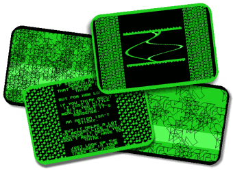
Concept-wise it's�a bit weak though, with only text supporting the revisited theme of categorisations from Clown. Still, the atmosphere is spot-on, and the creator (Puterman) can only be applauded for trying to do something different, and succeeding as well. Here's�hoping he'll soon prove able to keep it up in a longer�demo.
TRIAD
Manhood 2
(81)
It seems that Hollowman still hasn't said all about the misconceptions of
manhood. This time the point of view switches between that of a (spoiled) girl,
making clear to her boyfriend he's�interchangable, and that of the boy itself,
doubting if his current life is the one he wants. Quite an original method and
it works great too, especially when the finale kicks in. Here clever animations
are telling us to break down all icons, to follow the road less travelled, to be
true to oneself, even if the world will dislike you for it. For a c64 demo this
is heavy stuff indeed, but it is done in a powerful way with only the
too-cheerful music and Hollowman's�trademarked bad graphics spoiling the
experience a�bit.

WORTH CHECKING OUT
CIVITAS
Clown (67)
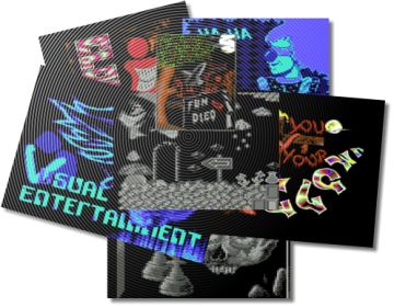
Appearantly Civitas is the latest group influenced by the contra-movement,
joining the likes of Triad, Wrath & Focus by putting the concept first. This
I�like very much. What I�don't like however is what they came up with: a
watered-down version of last year's�Manhood mixed with standard demo-effects.
The theme slightly shifted but it's�still about cultural archetypes. That
wouldn't be so bad if they had at least chosen a different format of execution
but alas, they didn't, and as such nothing new is to be seen here. Also, while
Manhood was constant in delivering the message, Clown knows several moments
which fail to fit in, like the two-sided endscroll, where the text changes from
being an integral part into the normal scene-kind. Maybe when they come up with
a more original way of presenting their story, hire a good graphician and let
their �real� composer do all the tunes, they'll be able to pull it off. But
for now it seems they're simply too lightweight to do�so.
DEKADENCE
Beertime 2 (67)
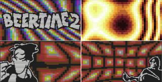
One could
consider this a concept demo, based on the art of drinking beer. However, I'd
rather recognize it for what it really is: a whole bunch of plasma-like effects
with some decent black & white graphics on top of it, timed to the music.
Nothing too original but the endresult is pleasant enough to look
at.�
EXTEND
Total
Epygt (67)
Almost
4�years old and finally released thanks to Crossbow/Crest, this piece of work
clearly shows its age with effects like whirlpools, twisted vertical rasterbars
and graphic-stretching (which was outdated in 1991). The music is a little
nervous but pleasant enough not too irritate you, and the graphics range from
okay-ish to excellent, with a beautiful black-white-gray piece taking the
throne. Compared to some of their other stuff, this one doesn't quite cut it
though. And the name bugs me, but I�guess that's�what it was meant
to�do.

EXTEND
Orivesi
(63)
Consider
this: the graphics have always been the highlight of an Extend demo. Yet in this
reviewer's�humble opinion, if they would have been left out of this one, the
end-result would have beenx much stronger. The intense flickering of both the
Extend �logo� and the fullscreen-picture later on is just too much and
diminishes the quality of the demo. A�shame really, because the other effects
are rather original and very pleasant to look at.�

CREST
Demus Interruptus
(61)
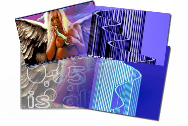
Nobody
can deny the absolute coding-power held by Crossbow, who's�been on top for
about 12�years now. And here he is again, in true �old school� fashion,
setting some records on vertical rasterbars. Problem is, that's�all we get,
apart from one nice looking picture (which holds nothing to the original pc
piece), with especially the first part being boring as hell. Even the coder
himself apologizes for using it, which only makes me wonder why he didn't leave
it out? Keeping in mind that he just wanted to present the world with a little
something until their c128 demo finally was released, I'll forgive him, but this
demo best be forgotten.
FORGET ABOUT IT
ACTIVE
O-Tech People 2 (43)
Lots of ugly big pixel effects. Even uglier graphics. Ending with a very
ugly filled vector. Avoid at any�cost.
ANUBIS
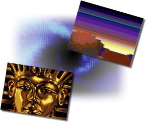
Sorrow (58)
This is
one of those typical effect-shows I've come to dislike so much in the past. And
with none of the effects being impressive, or even interesting, it's�really a
wonder that the demo as a whole seems to work on some kind of weird level. One
of the scene's�little miracles it is�then.
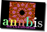
CIVITAS
Robotics
(54)
Lesson:
just having a sensible message does not a good demo�make.
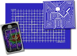
DEKADENCE
Fitspeak 2 (13)
Disgusting. Message to the creator: grow up, please.
DMAGIC
Universal DMA Birthday Demo
(38)
Like the
name says, it's�only a birthday demo and most of the times those are not of the
highest quality. No surprises here then, apart from the absolute low that the
graphics�reach.

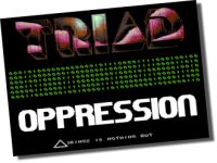
TRIAD
Oppression
(35)
Basically
this is nothing more than a modified intro, revolving around a scrolltext
I�can't be bothered to read. Ah well, shows that even a winning team like Triad
misses now and�then.
all demos were released in the 3rd quarter of 2001.�
Discussion: 71 reactions


